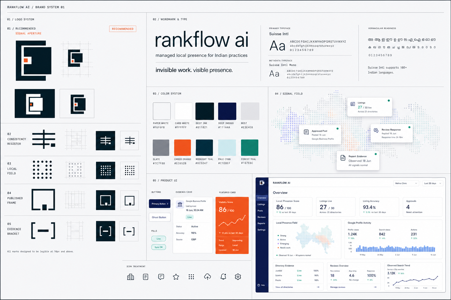
Brand System
RankFlow AI Design Tokens
Version: 2.0.0
docs/brand/tokens/README.mdOn this page
Version: 2.0.0
Identity: Rise
Visual system: Quiet Signal
Last updated: 2026-06-13
These tokens are the source of truth for the RankFlow marketing site, dashboard, mobile interfaces, reports and email UI.
Files#
| File | Purpose |
|---|---|
design-tokens.json |
Canonical structured source for JavaScript, Tailwind, Style Dictionary and design-tool imports |
design-tokens.css |
CSS custom properties for application and marketing interfaces |
_tokens.scss |
SCSS variables and core component mixins |
The JSON file defines the token architecture. CSS and SCSS must remain value-equivalent to it.
Brand Foundation#
Identity#
The Rise mark represents local signals becoming progressively stronger until they reach the orange booked outcome.
| Logo token | Value |
|---|---|
| Grid unit | 16px |
| Content footprint | 160px × 160px |
| Mark artboard | 176px × 176px |
| Right and bottom breathing room | 16px |
| Minimum digital size | 16px |
The logo geometry lives in rankflow-mark-rise.svg. Never reconstruct the mark from CSS.

Core Palette#
| Token | Hex | Role |
|---|---|---|
| Deep Ink | #011821 |
Primary text, dark UI, Rise signal bars |
| Ember Orange | #EC652B |
Rise destination, primary conversion, focus and booked state |
| Paper White | #F6F6F8 |
Product canvas |
| Card White | #FFFFFF |
Cards and elevated surfaces |
| Mist | #E3E4E8 |
One-pixel rules and borders |
| Graphite | #3B3E47 |
Accessible secondary text |
| Slate | #7C7F88 |
Tertiary metadata only |
| Forest Teal | #167E6C |
Verified success and live evidence |
Supporting colors are Midnight Teal, Deep Indigo, Sky Blue, Pale Cyan, Mint and Lavender. They are intended for data visualization, information states and illustrations, not competing brand accents.
Color Rules#
- Orange is for outcomes. Use Ember Orange for the logo corner, primary conversion moments, booked states, active indicators and focus rings. Do not use it as a decorative section background.
- Evidence is teal. Forest Teal means verified, successful or live. It must not be used for neutral decoration.
- Deep Ink carries the interface. Primary text, primary buttons, navigation and dense technical surfaces use Deep Ink.
- Paper and cards stay distinct. Paper White is the canvas; Card White is the elevated content surface.
- Color never acts alone. Pair success, warning and error colors with text or icons.
Accessibility#
The semantic aliases are intentionally different from some raw palette roles:
- Deep Ink on Paper White:
16.86:1 - Graphite on Paper White: suitable for normal secondary text
- Forest Teal on Paper White:
4.59:1 - White on Forest Teal:
4.96:1 - Deep Ink on Ember Orange:
5.60:1 - White on Ember Orange:
3.25:1, so accent buttons use Deep Ink text - Slate on Paper White:
3.71:1, so Slate is limited to tertiary or large metadata
Links use Midnight Teal with an underline or another non-color affordance. Ember Orange is not the default body-link color.
Typography#
Families#
- Primary: Suisse Intl
- Production fallback: Inter, then the system sans-serif stack
- Metadata and evidence: Suisse Intl Mono, then SF Mono
The logo wordmark is outlined inside the SVG and does not depend on a web font.
Scale#
| Role | Size / line height |
|---|---|
| Caption | 12 / 18 |
| Body small | 14 / 21 |
| Body | 16 / 24 |
| Body large | 18 / 26 |
| Subheading | 20 / 28 |
| Heading small | 24 / 32 |
| Heading | 28 / 36 |
| Heading large | 40 / 44 |
| Display | 60 / 66 |
Use regular and medium weights by default. Semibold is reserved for compact emphasis. The system intentionally excludes a default bold weight to preserve the quiet editorial character.
Geometry#
- Base spacing unit:
4px - Standard component radius:
8px - Small technical radius:
2px - Large display radius:
12px - Badge radius: fully rounded
- Standard card padding:
24px - Standard element gap:
12px - Standard section gap:
80px - Maximum content width:
1200px
Cards, buttons, inputs and navigation all use the same 8px radius. Avoid arbitrary radius values.
Elevation#
RankFlow uses blue-ink shadows rather than heavy neutral drop shadows:
shadow-subtle: normal cards and controlsshadow-outline: hairline floating separationshadow-inner: inset structureshadow-sm: menus and temporary floating UIshadow-xl: major dialogs and product mockupsshadow-focus: accessible Ember Orange focus ring
Prefer a 1px Mist border over elevation whenever hierarchy remains clear.
Motion#
Motion is calm and functional:
100ms: immediate state feedback150ms: hover and focus200ms: standard component transitions300ms: dialog and panel movement
Do not use bounce easing. Motion should communicate state change, not personality.
Icons And Data#
- Use Lucide icons.
- Default stroke width:
1.5px. - Standard sizes:
16px,20px,24px. - Use mono labels for evidence, metrics and technical metadata.
- Data series order: Forest Teal, Sky Blue, Lavender, Mint, Midnight Teal.
- Ember Orange is reserved for thresholds, anomalies and conversion markers in charts.
Component Principles#
- Primary button: Deep Ink with Paper White text.
- Accent button: Ember Orange with Deep Ink text.
- Card: Card White,
1pxMist border,8pxradius and subtle elevation. - Input: Card White,
8pxradius and orange focus state. - Sidebar: Deep Ink, Paper White text and a single orange active indicator.
- Badge: Mono typography and a fully rounded shape.
- Table: Paper White header, Mist rules and minimal row hover.
CSS Usage#
@import 'docs/brand/tokens/design-tokens.css';

.result-card {
  padding: var(--card-padding);
  color: var(--color-text-primary);
  background: var(--card-bg);
  border: 1px solid var(--card-border);
  border-radius: var(--card-radius);
  box-shadow: var(--card-shadow);
}

.book-button {
  color: var(--btn-accent-text);
  background: var(--btn-accent-bg);
  border-radius: var(--btn-accent-radius);
}
SCSS Usage#
@use 'docs/brand/tokens/tokens' as *;

.result-card {
  @include card-elevated;
  padding: $card-padding;
}

.book-button {
  @include button-accent;
}